

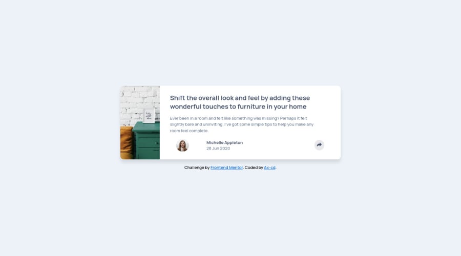
Design comparison

Solution retrospective
Hi! Here is my solution for this challenge: feedback on how I wrote the code is welcome, as well as advices to improve, thank you!
Community feedback
- @placetenoPosted over 2 years ago
Hi @Ax-cd, your component looks good, both in mobile and desktop, well done!
I had a couple of suggestions that could improve your solution. For your
.cardclass, using flexbox would make it easier to control the widths of the image and the content. You can add a gap and control the position of the elements much better. Also, instead of giving your .card a fixed width using percentages, try using<max-width>with rem, it's more responsive and it stays the same regardless of screen size.Regarding the media queries, there's no need to have one for mobile and desktop views. Usually, you decide what approach to use first, mobile-first or desktop-first and, once you decide it, just add the corresponding media queries for the other screen sizes. For example, you could have started with desktop-first writing the code for that view and then add media query for the mobile view, tablet, etc.
I hope this helps!
1@Ax-cdPosted over 2 years agoHi @placeteno, I updated my solution following your advice;
Regarding the media queries, I had a mobile-first approach, so I removed the <@media> for it. However, in the case of the img if I apply a <max-height> to it for the mobile, it remains the same for the desktop and I can't change it, any idea why?
Thank you for the feedback!
0@placetenoPosted over 2 years ago@Ax-cd The card looks great! I'm glad my advice was useful :)
As for the
<img>, it's usually better to simply add awidth: 100%and that will make it responsive and resize if it has to. The height is calculated automatically, but I have to say it looks great in both sizes already!1

Please log in to post a comment
Log in with GitHub
Join our Discord community
Join thousands of Frontend Mentor community members taking the challenges, sharing resources, helping each other, and chatting about all things front-end!
Join our Discord