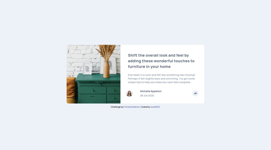
Article preview component with HTML, SASS, JavaScript
Design comparison
Solution retrospective
I have a question in connection with the desktop version. When we click the button and the container of the share, facebook, twitter, pinterest stuff appear, how can I make it so that it will be the same place no matter the window site. Cuz, I tried to force it to be above the button and it is in the right position when the width is 1024px but if I make the window size wider it ends up going away from the button a bit horizontally. Other than that I don't have any specific question but I would be happy to receive any kind of feedback.
Community feedback
- @YazdunPosted about 3 years ago
Hello Ildikó 👋 ! add
position:relativeto the parent element which in this case ismaintag, then addposition:absoluteto.social-containeron large screens, so.social-containerwill always position itself according to it's parent. Also you need to giveoverflow:visibletomainon larger screens.✅ I've already opened a pull request to your repository which will fix the issue
SIDE NOTE : use
prettierextension on your IDE to format your codeI hope this helps
Marked as helpful1
Please log in to post a comment
Log in with GitHubJoin our Discord community
Join thousands of Frontend Mentor community members taking the challenges, sharing resources, helping each other, and chatting about all things front-end!
Join our Discord
