Submitted 4 months ago
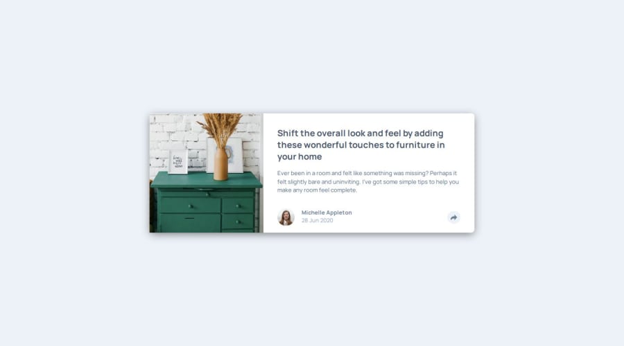
Article preview component with HTML + CSS + Vanilla JS

@phanthanhchungbyte

Design comparison
SolutionDesign

Solution retrospective
What are you most proud of, and what would you do differently next time?
I'm most proud of the way I handled responsiveness, the site is responsive and without issues to see the text. I also tried to closely followed the design dimension, and it turned out quite well.
What challenges did you encounter, and how did you overcome them?I think I got some issues with the tooltip being cut at the edge of the card. And I used overflow: visible for the main card, to allow the tooltip to get outside a bit to the right.
What specific areas of your project would you like help with?I need some help with the JS if it's good. And if my HTML structure is correct for this problem. Thank you so much!

Join our Discord community
Join thousands of Frontend Mentor community members taking the challenges, sharing resources, helping each other, and chatting about all things front-end!
Join our Discord