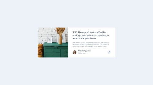
Article preview component with HTML, CSS and JavaScript

Solution retrospective
I manage to get as close as possible to the design. Next time I would take a different approach when creating the HTML tags. For example, using an empty div element for drawers.jpg is not the best approach, I think.
What challenges did you encounter, and how did you overcome them?When creating the responsive design, I was unable to visualize the share button at first. Once clicked it would hide under the tooltip element. My mistake was that I put the tooltip element inside the button. Then by setting z-index of the elements it was fine.
What specific areas of your project would you like help with?I would appreciate recommendations on the HTML tags I use.
Please log in to post a comment
Log in with GitHubCommunity feedback
No feedback yet. Be the first to give feedback on Aydan's solution.
Join our Discord community
Join thousands of Frontend Mentor community members taking the challenges, sharing resources, helping each other, and chatting about all things front-end!
Join our Discord