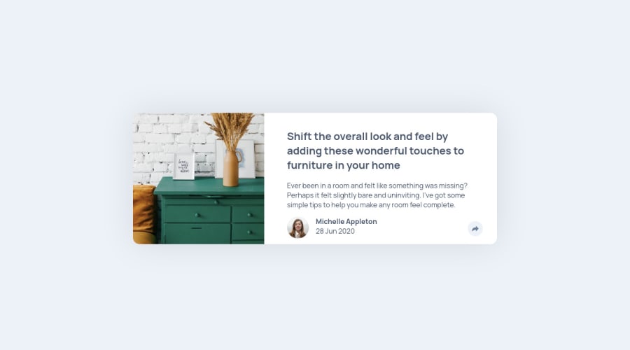
Design comparison
Solution retrospective
I'd like advice on closing the popup box when clicking outside the box. It totally has me stumped.
Community feedback
- @AlexKMarshallPosted about 3 years ago
Hey there, pop ups are surprisingly challenging and have loads of accessibility concerns (including, but not limited to, what happens when you click outside them).
You could do something like add an event listener to the document body, making sure it doesn't trigger when clicking inside the popup element by avoiding event bubbling. But you'd still have to handle all the other accessibility issues.
Instead, I'd just use a library. Something like https://atomiks.github.io/tippyjs/ will do what you need.
On a production site it's always worth knowing when to write something yourself and when to use a tried and tested tool. The only reason I'd every try writing a popup myself is to remind myself why not to do it :)
Aside from that, your solution looks very good, I love the transition animations. Just be careful with the semantics, you've got an h3 in there with no h2 anywhere above it.
Marked as helpful2@placodermPosted about 3 years ago@AlexKMarshall
Thanks!!
I'm just getting started with js and haven' used any libraries yet. However that's for sure the next step. tippy.js looks great.
Regarding the heading levels, I originally had no h1 because it felt like project was really about an element that would be a part of a larger page and the card we create would be a second level thing. But without an h1 I didn't pass the accessability. I hadn't considered the problem of skipping h2. Maybe my h3 on the share box isn't necessary.
Thanks for taking the time to look at the project. I really appreciate it.
0@AlexKMarshallPosted about 3 years ago@placoderm
Yes, your thinking around the heading levels is in the right direction. Here we only have a small component, so an h1 wouldn't normally make sense as soon as it was placed on a wider page. It makes these small component challenges slightly artificial.
That said, at work you may well be creating small components that will be used by someone else, so it's useful to think about how to make them flexible. Ideally your card component will work for someone who needs it to have an h2, and someone else who needs it with an h3, based on their specific page structure. That's not something easy to fix with just basic html, so I wouldn't worry about it now. But good to be aware of for later on. Lots of people building components don't think about these things and it can result in quite a confusing experience for people using the page with screen readers, or for search engines trying to index content.
1 - @placodermPosted about 3 years ago
Thanks!
I guess in the future I will code the page as if it were a complete unit for the sake of passing the tests, but I realize that the tests are only a tool.
0
Please log in to post a comment
Log in with GitHubJoin our Discord community
Join thousands of Frontend Mentor community members taking the challenges, sharing resources, helping each other, and chatting about all things front-end!
Join our Discord