Design comparison
SolutionDesign
Solution retrospective
What are you most proud of, and what would you do differently next time?
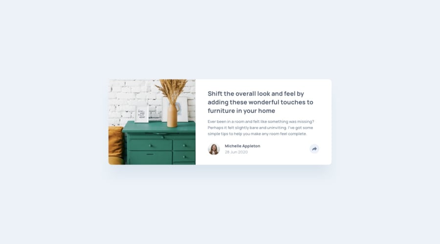
layout of the card maybe needs to change
What challenges did you encounter, and how did you overcome them?P: The layout of the card feels bad
P: The share tooltip is coded badly especially when I tired to center social media icons
P: making the share svg icon white when clicked on
S: I used filter CSS property maybe it's not the best but it works
reduce CSS file and rely as much as possible on Bootstrap
Community feedback
Please log in to post a comment
Log in with GitHubJoin our Discord community
Join thousands of Frontend Mentor community members taking the challenges, sharing resources, helping each other, and chatting about all things front-end!
Join our Discord
