Submitted about 3 years ago
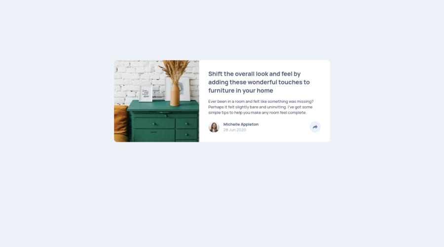
Article preview component /w flex on mobile & /w grid on desktop
@billgeorgop93
Design comparison
SolutionDesign
Solution retrospective
Well I used flex for mobile version, grid for desktop version and some js for the button. I have good comments that helps you understand the logic behind.
Community feedback
- @FlorianJourdePosted about 3 years ago
On mobile, maybe you can try to remove
.bottom-containerwhile clicking on share button ? By this way, you don't have to defineheight&padding-bottomproperty to the.content. You can also removetopfrom.pop-positioning. It while automatically go down your container.Edit : Instead of removing,
display: noneshould do the job !1
Please log in to post a comment
Log in with GitHubJoin our Discord community
Join thousands of Frontend Mentor community members taking the challenges, sharing resources, helping each other, and chatting about all things front-end!
Join our Discord
