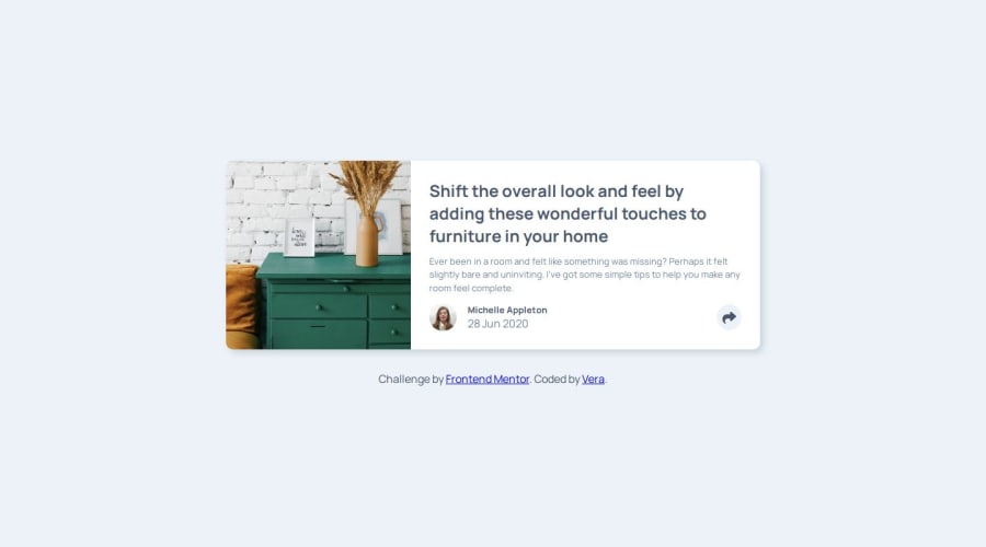
Design comparison
Solution retrospective
I would use a framework to make the project.
What challenges did you encounter, and how did you overcome them?I didn't have any problem in solving this challenge.
What specific areas of your project would you like help with?Any improvement for my project is welcome.
Community feedback
- P@tdimnetPosted 11 months ago
Hi @verakissyou17,
Great job with your project. I noticed that you used the same HTML elements for your social links for mobile and desktop, which is great. You also used
classList.togglefor adding and removing classes: this is perfect.Here are some improvements:
- You could add a cursor pointer when hovering over the button with your mouse. Even though you added a hover effect, I think adding a cursor pointer makes it easier.
- You used absolute position for your social links card, which is great. However, I noticed that you used percentages for the top and left properties. This is not something I tend to use; I prefer using pixels because it tends to fix the design according to your screen size. Here is a link from CSS Tricks you can use: https://css-tricks.com/almanac/properties/p/position/
Overall, your project looks great, and these minor adjustments will enhance its usability and design even further.
Keep up the excellent work!
Have a nice day, Tom.
Marked as helpful1@verakissyou17Posted 11 months ago@tdimnet Thanks a lot for your feedback and your advice! I will improve my solution as soon as I come back home from hospital! Actually, it is the old solution, i used it again for a learning path because it was required.
0
Please log in to post a comment
Log in with GitHubJoin our Discord community
Join thousands of Frontend Mentor community members taking the challenges, sharing resources, helping each other, and chatting about all things front-end!
Join our Discord
