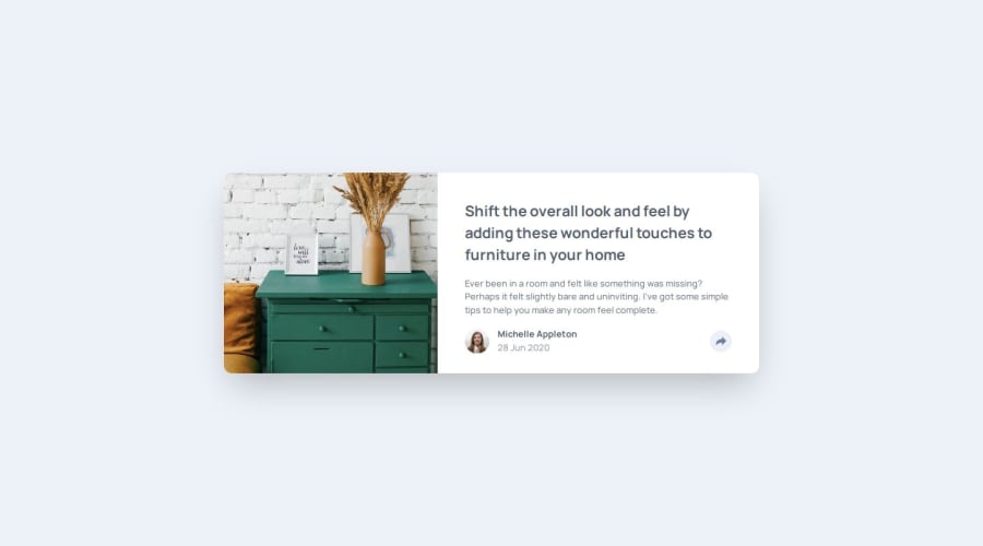
Article Preview Component using Tailwind
Design comparison
Community feedback
- P@kaamiikPosted 5 months ago
Hi. Congrats for doing this challenge. This is a really tough challenge in terms of the html structure to build a responsive pop up for both desktop and mobile users. I noticed some few notes that I think It's better to mention:
-
It's really important your page be responsive at minimum 320px. As I see, there is an overflow on the 320px to 335px for the share links and the share button on mobile view. I think If your div is a flex, then you can use flex-wrap to solve it. Or maybe another solution...
-
Another issue is that your social links are not just image. They are links that should be clickable (
atags) and need to have hover and focus on them.
1@mehrnaz98Posted 5 months agoHi @kaamiik, thank you so much for the helpful tips! I really appreciate your guidance.
0 -
Please log in to post a comment
Log in with GitHubJoin our Discord community
Join thousands of Frontend Mentor community members taking the challenges, sharing resources, helping each other, and chatting about all things front-end!
Join our Discord
