Submitted 5 months ago
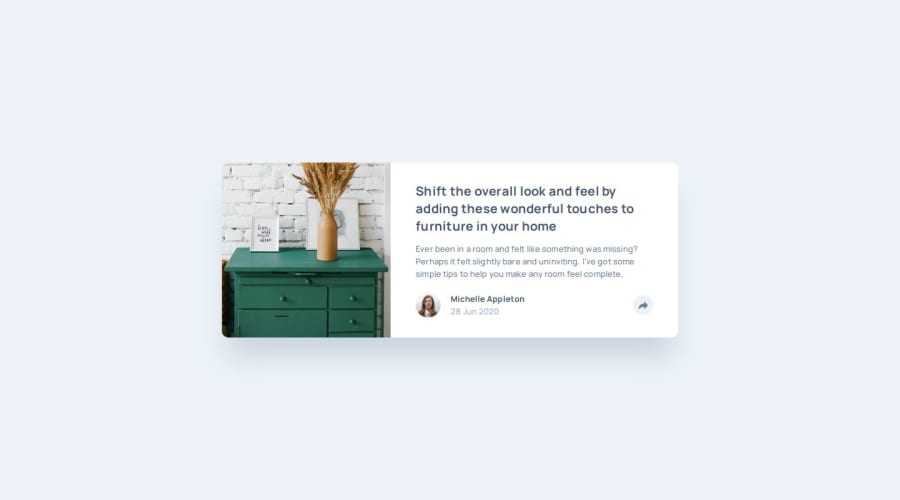
Article Preview Component using SvelteKit and Tailwind CSS
#svelte#tailwind-css
P
@JYLN
Design comparison
SolutionDesign
Solution retrospective
What challenges did you encounter, and how did you overcome them?
I did run into some issues with ensuring that the mobile overlay for the social media share buttons was aligned properly, but after playing with the padding for the container element I used for the card's footer and the container for the overlay, I was able to get things to line up fairly well.
Join our Discord community
Join thousands of Frontend Mentor community members taking the challenges, sharing resources, helping each other, and chatting about all things front-end!
Join our Discord
