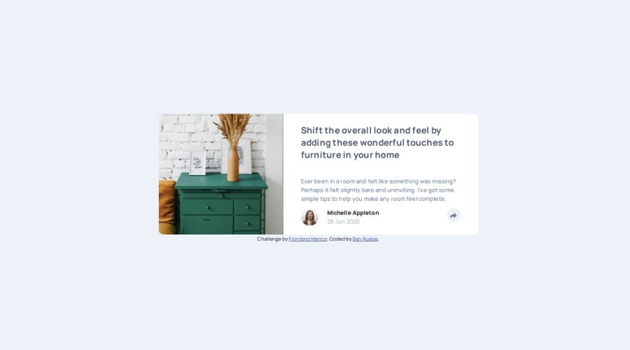
Article Preview Component using SCSS/HTML and Vanilla JS


Design comparison

Solution retrospective
I am most proud of how fast I was able to create a working solution. It is definitely not perfect but I was able to build everything in just a couple hours. Practice is paying off!
What challenges did you encounter, and how did you overcome them?A challenge I encountered was having different share bubbles for the dynamic screen sizing and how to handle the button interactions.
What specific areas of your project would you like help with?I still don't fully understand how to dynamically size things so that they 1. still match the design exactly, and 2. seamlessly change size while looking good.
Community feedback
- @laura-nguyenPosted 8 months ago
When it comes to dynamically sizing elements, you can use media queries for mobile and desktop. Within those media queries, you can specify the width, height, and position of the social container. You can use position: relative on a parent element, and then position: absolute: on the social container, and you can adjust the position using top and right.
0

Please log in to post a comment
Log in with GitHub
Join our Discord community
Join thousands of Frontend Mentor community members taking the challenges, sharing resources, helping each other, and chatting about all things front-end!
Join our Discord