Submitted 9 months ago
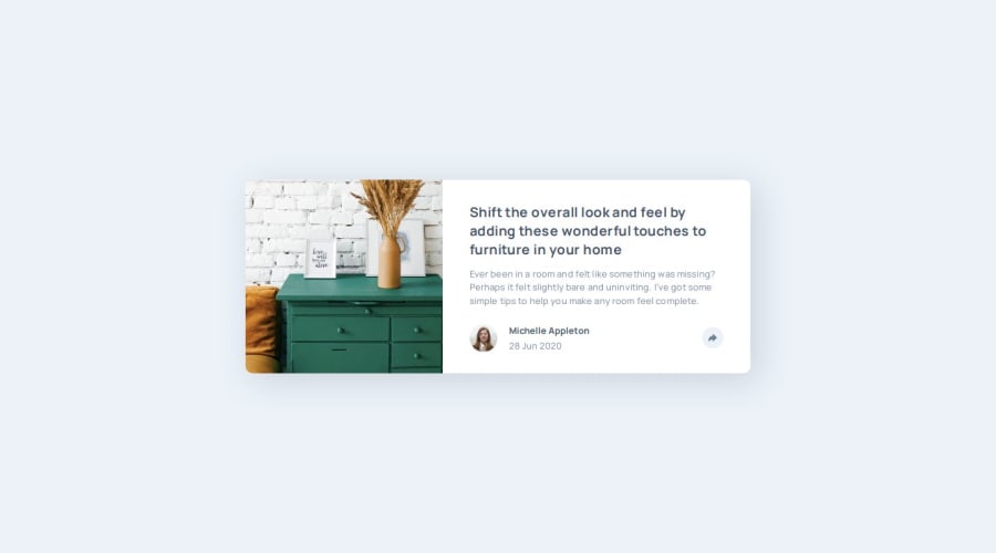
Article preview component using SCSS, Grid, BEM, JS
@ankkiel
Design comparison
SolutionDesign
Solution retrospective
What are you most proud of, and what would you do differently next time?
I will be glad to receive your feedback!
What specific areas of your project would you like help with?- When I make the screen smaller, the element with class
.socialmoves to the right off the screen. - When the screen is reduced, the element with the
.article__share-buttonclass goes down due to the text moving higher
How can I position better?
Community feedback
Please log in to post a comment
Log in with GitHubJoin our Discord community
Join thousands of Frontend Mentor community members taking the challenges, sharing resources, helping each other, and chatting about all things front-end!
Join our Discord
