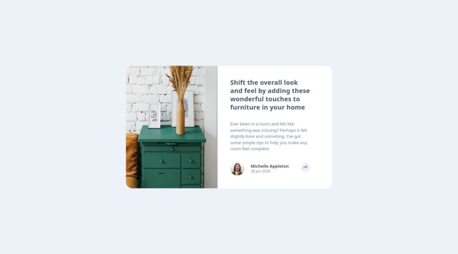
Design comparison
Solution retrospective
For this challenge, I'm most proud of:
Successfully implementing a responsive layout that adapts well to different screen sizes.
Using pure HTML and Sass helped reinforce your understanding of styling with preprocessors.
Debugging layout issues and ensuring the interactive pop-up works smoothly.
Next time, I might:
Plan a more structured approach before coding to avoid layout issues later.
Experiment with CSS animations or transitions to make the pop-up appear more smoothly.
What challenges did you encounter, and how did you overcome them?1️⃣ Positioning the Pop-up
Challenge: The pop-up was not positioned correctly on mobile breakpoints. Solution: Adjusted absolute positioning, used CSS media queries, and tested different flex/grid layouts to ensure responsiveness.
2️⃣ Making the Component Fully Responsive
Challenge: The layout didn't adapt well to certain screen sizes. Solution: Used flexbox/grid, fine-tuned media queries, and optimized spacing for better mobile compatibility.
3️⃣ Handling Hover and Click States
Challenge: Ensuring the pop-up appears correctly on both hover (desktop) and click (mobile). Solution: Implemented conditional Sass styles and tested behavior across devices.
What specific areas of your project would you like help with?One challenge I faced was positioning the pop-up correctly on mobile. The goal was to make it span the full width and appear at the bottom of the screen, but I couldn’t get it to work as intended. I couldn't fully resolve this issue despite experimenting with different CSS approaches. If you have any suggestions or feedback, I’d love to hear them!
Community feedback
Please log in to post a comment
Log in with GitHubJoin our Discord community
Join thousands of Frontend Mentor community members taking the challenges, sharing resources, helping each other, and chatting about all things front-end!
Join our Discord

