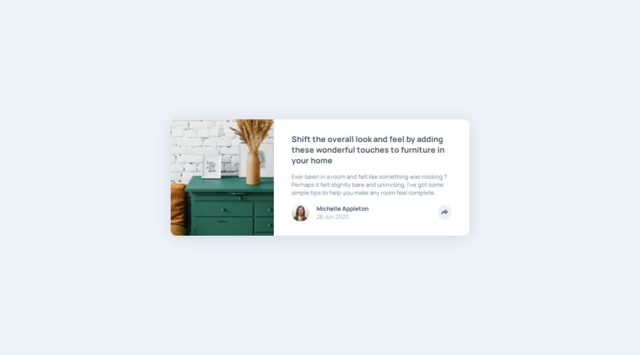


Design comparison

Solution retrospective
using React , i made two components , one for the Card and one for the Modal that would open when i click the share button .
then i used useState to toggle opening/closing the Modal component.
the css was kinda annoying to figure out , especially for the mobile view .
What specific areas of your project would you like help with?if there is a better/simpler way to style the project and use react , please let me know .
Community feedback
- @codi-AndrePosted 9 days ago
Good job! this one was really tricky too me as well, you can add an arrow to your modal using a pseudo element:
.your-modal::after {
  content: " ";
  position: absolute;
  top: 100%;
  left: 50%;
  margin-left: -5px;
  border-width: 5px;
  border-style: solid;
  border-color: black transparent transparent transparent;
}
Designers expect us to follow their design, but only developers understand the limits of the technology, if your modal does not have space to show up, show it on the left side until it has space, it is better than overflowing the page and become unreachable. the same with the image, keep the card vertical until it has space to be horizontal.
Do not comment your code with
{/* footer */}use the tag<footer>, the same with the comment{/* share button */}, if the classshareBtn, the imageshareIcnand the alt textshare icondoes not tell me that this is a share button, nothing will.Tip for accessibility, when using svgs and images within buttons, prefer to add an
aria-labelattribute, an alt text must provide context, it is better to write 'open share menu' instead of 'share icon'.Marked as helpful0

Please log in to post a comment
Log in with GitHub
Join our Discord community
Join thousands of Frontend Mentor community members taking the challenges, sharing resources, helping each other, and chatting about all things front-end!
Join our Discord