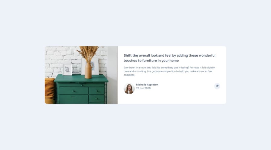
Design comparison
SolutionDesign
Solution retrospective
What are you most proud of, and what would you do differently next time?
Using the CSS position property properly. I had to position the elements carefully.
Getting the share icons to display somewhat properly on both mobile and desktop screens. I am aware it's not perfect but its a close start.
What specific areas of your project would you like help with?No figma files so scaling might be off. So any insight there would be useful
Community feedback
Please log in to post a comment
Log in with GitHubJoin our Discord community
Join thousands of Frontend Mentor community members taking the challenges, sharing resources, helping each other, and chatting about all things front-end!
Join our Discord
