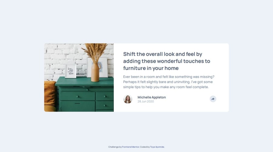


Design comparison

Solution retrospective
I had a really really hard time getting the share feature of the minimized screen to revert back to its default state in the enlarged screen. No matter what trick I tried, I couldn't figure it out. I ended up duplicating the same features in my html for the media query features.
I'm pretty sure that was wrong.
Community feedback
- P@RetroApePosted 4 months ago
Hi Toye.
I am not sure what is the problem with the share feature, but you have a bigger problem on your hands. I have seen your
preview-carddoesn't have width or height set. It only acts as a flex container. So basically, image and text are just "glued" together..... Scratch that. Image is actually behind the text. Why did you do it this way?You already know how to do it the right way and you have done it in Blog Preview Card.
It is the same thing, only difference is that the image should touch the edges of the card.
The preview card should be 730 x 280 (px). Or in rem:
max-width: 45.625rem;min-height: 17.5rem;Take off all margins/radius/height/width on
text-section/img. Put background color and radius on the preview card.The
imgshould have a certain width. Usemax-inline-widthormax-width. Also addobject-fitandobject-position.The
text-sectionshould have a padding.From this base you build further. Remember that your starting point is always a fully responsive HTML file. We ruin this responsiveness with CSS. Whenever something doesn't behave properly, it is time to check why and change or possibly delete the property that is causing the issue. If you try to solve these issues by adding more CSS..... well, no one can solve them this way.
Try to learn a bit about the Dev Tools on the browser, they will help you understand the layout much better.
Please be free to check my solution and if you have any questions I will be happy to help if I can. ChatGPT may also help with giving a proper resource instead of endlessly searching for an answer.
I hope I was able to help a little bit.
Best of Luck!
Marked as helpful1@Toye-devPosted 4 months agoHi Tomislav,
Thanks a lot for the feedback you gave my work. I most times - after a few days - find it challenging reading code I wrote myself. Its like "what the heck did you do here...?" So that makes me appreciate the effort from someone else. I've been able to work on the corrections you pointed out, and updated them.
About getting something right in a previous challenge and getting it wrong here, apparently I just do what appears to work. However, your point on responsive html is well taken, and now I understand it better on reviewing the code and design, as you suggested. Thanks.
I'll get more intentional, learning more about Dev Tools to understand layout better.
I did check your solution and design, and it was absolutely cool. I liked the transitions, and the slide-in feature for the smaller screen. But you may want to check it out on a smaller device though, maybe a phone. Everything is out of place...probably something you overlooked. But besides that, great work. Nice shadow too.
Yes, you were able to help significantly. *Responsive htmls. Thanks.
I hope you'd review future codes I write.
Happy Coding!
1P@RetroApePosted 4 months ago@Toye-dev
The code is like that. Mystical forces change it on a daily basis; that is why even experienced programmers don't understand their code after several days.
Thank you for pointing out the problem. I actually forgot about it after finally coming up with a solution for a bigger problem.
I am glad you liked my solution and appreciate the feedback. And since you asked, I will follow you to review your next solutions.
All the Best!
Marked as helpful1

Please log in to post a comment
Log in with GitHub
Join our Discord community
Join thousands of Frontend Mentor community members taking the challenges, sharing resources, helping each other, and chatting about all things front-end!
Join our Discord