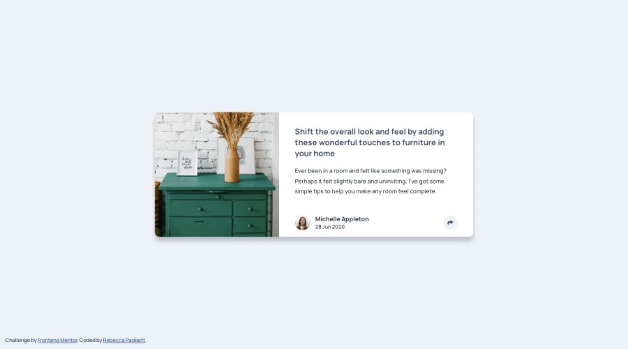
Article preview component using HTML, CSS & JavaScript
Design comparison
Solution retrospective
Hello everyone,
Hope all is well.
This is my solution to the Article preview component. In this project, I made sure the tooltip is accessible by using aria
attributes [aria-expanded="true"] and [aria-expanded="false"]
and when you press somewhere else like the card for example the tooltip will close. Additionally, you can press the ESC
to hide the tooltip and pressing TAB on the button a dotted outline will appear.
Any other feedback would be welcome and greatly appreciated.
Community feedback
- @JeuriMorelPosted about 1 year ago
You did a good job with this one, Rebecca, nicely done.
I've run into two issues with the tooltip. The first is that its placement looks to be relative to the viewport and not the
button
which feels a little awkward as where it appears onscreen is rather inconsistent. The second is that since it has a lowerz-index
than thebutton
, when the two overlap thebutton
covers part of the tooltip. By default the button is covering the RE in SHARE when I open it while viewing the page on my laptop at fullscreen.Marked as helpful0@bccpadgePosted about 1 year ago@JeuriMorel Thank you for the feedback and will fix the solution per your recommendations.
0@bccpadgePosted about 1 year ago@JeuriMorel
Can you explain to me what area of the code needs to be fixed with the tooltip and the button because I am unsure what to do?
Thanks,
Rebecca
0@JeuriMorelPosted about 1 year ago@bccpadge
These changes fixed everything for me when playing around with the dev tools. (I didn't notice any negative side effects, but you should double check just in case.)
- Add
position: relative;
to either thearticle__card
orarticle_group
so that the tooltip's positioning is relative to the content of the card. - Play around with the tooltip's inset value for large viewports. Something like
inset: auto 17% 35% auto;
is closer to the desktop design I saw on the challenge page. - When you do the above, part of the tooltip gets cut off because the card isn't allowing for overflow. Removing
overflow: hidden;
from the card fixes this. Didn't find a need for the overflow to be there, but it's possible I missed something. - Just in case for some reason there continues to be overlap, I would adjust the
z-index
on the tooltip to at least be equal to or higher than thebutton
's value.
Marked as helpful0@bccpadgePosted about 1 year ago@JeuriMorel
I want to let know you, I updated the code and everything looks good now.
1 - Add
Please log in to post a comment
Log in with GitHubJoin our Discord community
Join thousands of Frontend Mentor community members taking the challenges, sharing resources, helping each other, and chatting about all things front-end!
Join our Discord