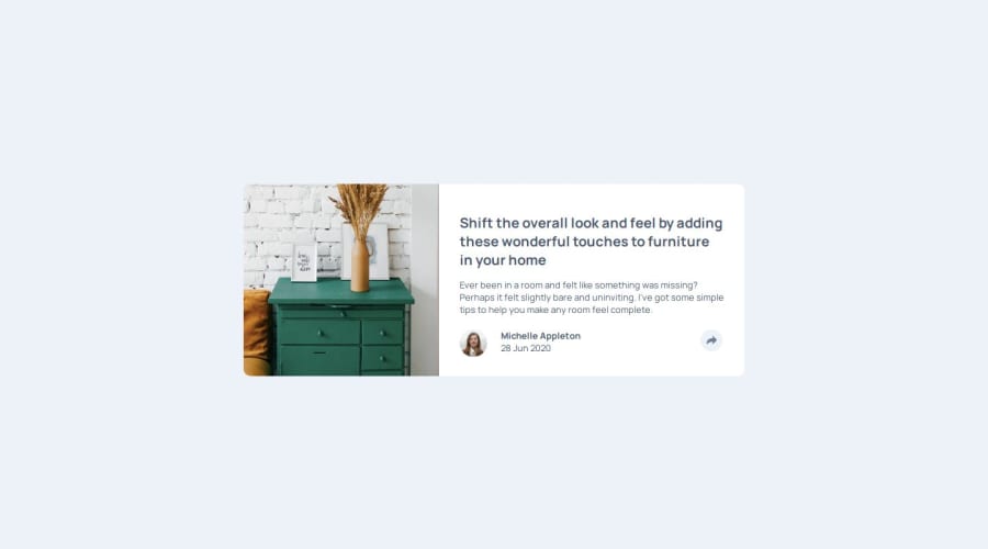
Design comparison
Solution retrospective
Persisting despite having quite a few issues with the layout of the popup. Also, including JavaScript for user interaction. Generally, I think I did a good job with the look of the component in relation to the design too.
What challenges did you encounter, and how did you overcome them?The most difficult aspect was positioning the popup for both desktop and mobile views. I didn't get it pixel-perfect on both mobile and desktop but fairly happy with how it turned out. I did a lot of googling, using stack overflow, w3 schools and also saw some examples of how people approached their own solutions to this challenge.
What specific areas of your project would you like help with?Any ideas as to how I could improve the position of the popup so that it fits exactly like the designs. The position of the popup changes when view on large to larger screens.
Community feedback
- @Jeffreyai7Posted 12 months ago
Hey there,
Good work in attempting the Challenge. I think you can make use of the Margin property in the position of the Pop-up feature when clicked and also, to make it work in a particular screen size, you can use the JS window.innerWdth property to control the changes.
Happy Coding
1@lawlawsonPosted 12 months ago@Jeffreyai7 Thanks for the suggestions, much appreciated and something I will look into.
0
Please log in to post a comment
Log in with GitHubJoin our Discord community
Join thousands of Frontend Mentor community members taking the challenges, sharing resources, helping each other, and chatting about all things front-end!
Join our Discord
