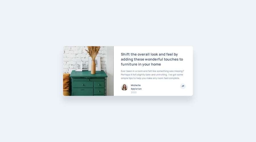
Design comparison
SolutionDesign
Solution retrospective
What are you most proud of, and what would you do differently next time?
Using the DOM to manipulate the interaction
What challenges did you encounter, and how did you overcome them?I had difficulty making the share-container disappear when clicked in the mobile version but i was able to let know JS that there is a mobile version when you click on the button.
What specific areas of your project would you like help with?none i think the more and more i build the more and more i will improve
Community feedback
Please log in to post a comment
Log in with GitHubJoin our Discord community
Join thousands of Frontend Mentor community members taking the challenges, sharing resources, helping each other, and chatting about all things front-end!
Join our Discord
