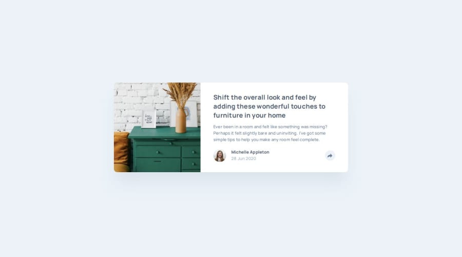
Article preview component using CUBE CSS & Sass


Design comparison

Solution retrospective
Surprisingly, working with JavaScript was not difficult. Although I'm not used to the syntax and had to look up a few things, overall, it went smoothly.
What challenges did you encounter, and how did you overcome them?I encountered some challenges with positioning the image and the popup for this project. I attempted to make the image adjust its size based on a parenting div, but I struggled with it. The image overflowed its container on mobile, while on larger screens, it appeared too small. Eventually, I opted to move all the styling directly to the image, which I have found to be an easier approach based on my past experience.
Working with position: absolute; elements for the popup was difficult for me as I'm not accustomed to it. It involved a lot of trial and error, and I realized that I need more practice with these kinds of elements. Additionally, I encountered issues with the popup on larger screens because it had to overflow the card. I initially set an overflow: hidden; on the card to automatically adjust the border radiuses of the elements on top of the card, but this approach didn't work due to the popup. Looking back, I could have planned this aspect better to save myself some time.
The biggest challenge I faced was dealing with the popup. It doesn't follow the typical disclosure or modal patterns as it overlaps other elements on the page. I wanted to ensure that the popup didn't render the other content on the page inaccessible, so using a modal pattern was not an option. With assistance from a senior developer, I experimented with the `` element to prevent access to the content behind the popup when it was open. However, I encountered issues with keyboard focus on smaller screens.
Ultimately, I decided to use the inert attribute on the content behind the popup when it was active on mobile. Additionally, I made sure that the focus remained on the button when the popup opened, making it easier to close.
Any suggestions and comments on how I can improve are welcome!
Community feedback
- P@kaamiikPosted 10 months ago
Congratulations. You did very well in this challenge. I also did this challenge for the second time. The first time, I made many mistakes in writing HTML code, but it got better this time. I looked at your code, it was very good. I noticed that you used the
visibility: hiddenproperty in one section. I think the reason was that you wanted to use thetransitionprop. Is that correct? Or did you want to avoid using thedisplayproperty twice?1P@moadavouPosted 10 months ago@kaamiik That's correct! You can't use
transitionon thedisplayproperty. I addedvisibility: hidden;to remove the element from the DOM.opacity: 0;technically makes it completely hidden, so I'm unsure ifvisibility: hidden;is necessary.0P@kaamiikPosted 10 months agoIf you remove the
visibilityproperty and just useopacity, the popup will still be hidden initially because ofopacity: 0. However, even when it’s hidden, it will still be able to receive focus and be interacted with, because it’s technically still “visible” in terms of document flow. So I think both of them is necessary @moadavouMarked as helpful1

Please log in to post a comment
Log in with GitHub
Join our Discord community
Join thousands of Frontend Mentor community members taking the challenges, sharing resources, helping each other, and chatting about all things front-end!
Join our Discord