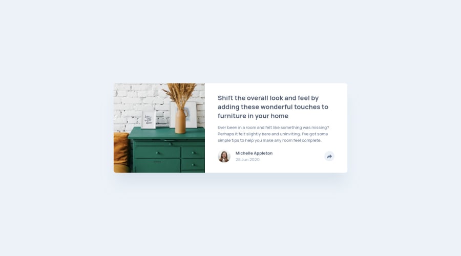
Article preview component (Tailwind CSS + JavaScript)
Design comparison
Solution retrospective
Hi there 👋, I’m Melvin and this is my solution for this challenge. 🚀
🛠️ Built With:
- TailwindCSS
- npm - prettier
Any suggestions on how I can improve and reduce unnecessary code are welcome!
Thank you. 😊✌️
Community feedback
- @ApplePieGiraffePosted about 2 years ago
Greetings, Melvin Aguilar 🧑🏻💻! 👋
Just wanted to drop in and say amazing work on yet another challenge! 👍 The card component looks great and you've paid great attention to detail in making your solution accessible! 👏
I also love the little attribution that you can click on in the corner of the page! 😊
Keep coding, my friend (and happy coding, too)! 😁
2@MelvinAguilarPosted about 2 years ago@ApplePieGiraffe Thank you so much for your kind words and encouragement! I'm glad to hear that you liked the component. It means a lot to me that you took the time to give me this feedback. Keep coding and have a great day! 😊
1 - @InterestingPlusPosted over 1 year ago
Congratulations.. I have some recommendations for you..
Give It
height: 100dvhinstead of100vhfor Best Performance on Mobile Devices..It will remove Extra Scroll space in mobile device.
Thanks..
1@MelvinAguilarPosted over 1 year ago@InterestingPlus Thank you for your comment! I'll definitely incorporate your recommendation into my future solutions. However, to ensure compatibility with older browsers, I'll also maintain
min-height: 100vhas a fallback. I apologize for my delayed response! 🙏1 - @AhmedAlhareesPosted about 2 years ago
Nice work <3.
1@MelvinAguilarPosted about 2 years ago@AhmedAlharees Thank you! I'm glad you like it.
And I'm sorry for the late reply.
0 - @karthispPosted about 2 years ago
Hi @MelvinAguilar you've done a great job with implementing the given design. Keep up the good work. I've got a lot of things to learn from you.
Just a small suggestion:
I see that you've used clip for sr-only (H1), instead try using clip-path. Apparently, that's what is recommended. https://developer.mozilla.org/en-US/docs/Web/CSS/clip-path
1@MelvinAguilarPosted about 2 years ago@karthisp Thank you for the kind words and for the suggestion! I appreciate it. However, I am using the Tailwind CSS framework, which includes the
sr-onlyclass by default, and it uses clip for the screen reader text. So, I used the styles that come by default in the framework, but I will take it into account.Thanks again for your suggestion and for taking the time to review my work!
1 - P@shrki416Posted about 2 years ago
@MelvinAguilar Incredible work! Code is easy to read, follow and understand. Not much to improve if at all. Love how semantic and accessibility focused your work is, keep it up. Footer is a nice touch as well :)
- Ahmed
1@MelvinAguilarPosted about 2 years ago@shrki416 Thank you, I appreciate your feedback !
0 - @AlexKolykhalovPosted about 2 years ago
Perfect as always!! Did this atomic css classes tailwind framework? I'm I right?
Nice footer!! I'll take note.
1@MelvinAguilarPosted about 2 years ago@AlexKolykhalov Thank you, I appreciate your comments
Yes, I used the Tailwind CSS framework
0 - @eliofloPosted about 2 years ago
Hello,
I really appreciate your solution, it's great! I noticed that the footer element is present in the HTML code, but it doesn't appear to be showing up in the browser. Any reason?
Elio Flores
1@MelvinAguilarPosted about 2 years ago@elioflo Hi ! Great to hear that you appreciate my solution! As for the footer element, it's actually present on the page, but it's hidden by default. I implemented a tooltip feature where the footer with my attribution link only appears when the user clicks on the button with my avatar. So, if you click on the avatar button, the footer should appear as a tooltip.
All the best.
0@eliofloPosted about 2 years ago@MelvinAguilar Sorry, at first glance, I didn't notice the avatar. . It looks great!
0 - @PepeleenoPosted about 2 years ago
I am a beginner in frontend. Your solution is awesome. No improvement is necessary, I guess 😅. It is just purefect 👏
1@MelvinAguilarPosted about 2 years ago@Pepeleeno Thank you for the positive feedback!
0 - @hyeo151Posted almost 2 years ago
Awesome work MELVIN! love your clean design :)
0 - @Shah-devsPosted almost 2 years ago
Hey Melvin ! your solution is flawless, brilliantly done! I am so glad that you liked my solution to this challenge, thank you. I looked carefully at your main.js and It really helped to learn how to write functions for on/off button. I do my best to be consistent and do at least one challenge a week to keep up with this amazing community of you guys. 👩💻👨💻 Thanks again 🙏
0 - @fodluPosted about 2 years ago
How your code feels so smooth and clean makes me want to re-write mine from scratch again. how did you become this perfect? show me some secrets, I'm ready to learn
and how did you gathered those points with less solutions compared to mine?
0 - @furkansipahiogluPosted about 2 years ago
Your code looks amazing and so clean I wonder how you became so successful and consistent. Can I have your email or any contact account. I want to learn from you and ask some questions so I can do better projects :)
0@MelvinAguilarPosted about 2 years ago@furkansipahioglu Thank you for your kind words and appreciation! I'm glad you found my code clean. You can reach me at melvinaguilarhdz@gmail.com. Looking forward to hearing from you!
1
Please log in to post a comment
Log in with GitHubJoin our Discord community
Join thousands of Frontend Mentor community members taking the challenges, sharing resources, helping each other, and chatting about all things front-end!
Join our Discord
