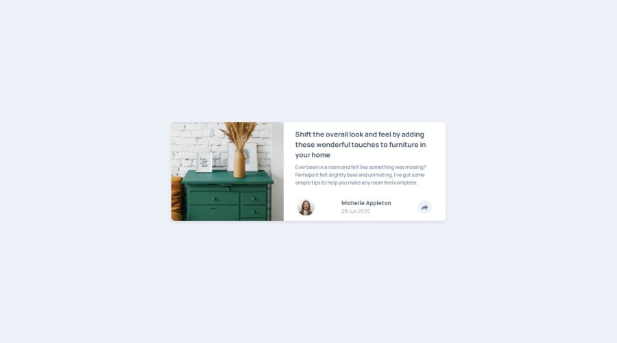
Article preview component submission using Vite, React, TypeScript
Design comparison
Solution retrospective
This submission is NOT complete. I found the share section part for the desktop design to be incredibly challenging. I'll need to come back in the future for this.
What specific areas of your project would you like help with?That share section in the desktop view.
Community feedback
- P@Fable54321Posted 5 months ago
Looks really good !
Personally I woudl have maybe triggered the media query at a little wider width to swicth between mobile and desktop layout, but it doesn't look too bad this way.
The react looks well structured as well.
Of course there is a few dimensions that seems off, personally I will work on the desktop version with a screen width of 1440px and mobile with a screen width of 375px (these are given in the style guide). I try to have everything looks spot on for these two sizes and tehn I make sure everything in between looks good.
0
Please log in to post a comment
Log in with GitHubJoin our Discord community
Join thousands of Frontend Mentor community members taking the challenges, sharing resources, helping each other, and chatting about all things front-end!
Join our Discord
