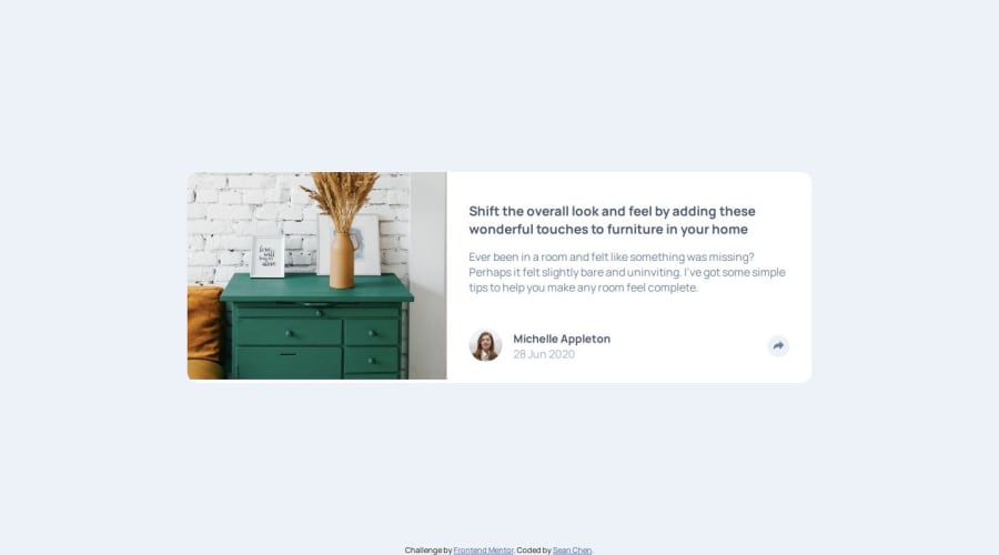
Design comparison
Solution retrospective
I am proud of using Vanilla JS to get the tooltip to display on the desktop and mobile designs when share button is clicked. It's been a while since I used vanilla JS to work on webpages as I primarily code in React and TypeScript.
What challenges did you encounter, and how did you overcome them?Some challenges I encountered include getting the design to match the mobile and desktop versions. So far the mobile version is successful. However, the tooltip on the desktop version is not displayed correctly even though it displays to the left of the shared icon when clicked.
What specific areas of your project would you like help with?I would like some help in placing the tooltip above the share icon when page is displayed in desktop version.
Community feedback
- @SherzodToshpulatovPosted 5 months ago
Looks Good! To place the tooltip you can use CSS positioning like; top 50px; right -100px;
Marked as helpful0
Please log in to post a comment
Log in with GitHubJoin our Discord community
Join thousands of Frontend Mentor community members taking the challenges, sharing resources, helping each other, and chatting about all things front-end!
Join our Discord

