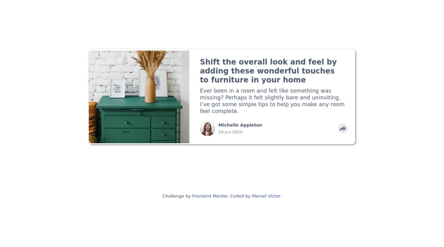
Design comparison
SolutionDesign
Solution retrospective
This project was a little bit challenging as my share popup box kept moving around the screen at different screen sizes, mostly for the desktop design
If anyone can help me fix it and allow, I'd be grateful. Feedback and contributions would be highly appreciated
Community feedback
- @AghlaAbdoPosted over 1 year ago
Great job, you did very nice
I have some notes for you to consider to further improve your design:
- You forgot to set the background color as in the image, colors are very important in web design.
- You need to make the shadow more blur and more transparent to reach the same effect.
- To center
<main>on the page, you can use flexbox or grid instead of margin. T use flexbox you need to set body desplay:flex:
body{
min-height: 100vh;
display: flex;
align-items: center;
justify-content: center;
}
But also .attribution will be set as flex, to avoid that you can set it's position to absolute and position it at the bottom of the page, Like so:
.attribution {
    position: absolute;
    bottom: 15px;
    left: 0;
    right: 0;
    margin: 0 auto;
}
I hope you got something from this. Good luck on your journey
0
Please log in to post a comment
Log in with GitHubJoin our Discord community
Join thousands of Frontend Mentor community members taking the challenges, sharing resources, helping each other, and chatting about all things front-end!
Join our Discord
