Design comparison
SolutionDesign
Solution retrospective
What are you most proud of, and what would you do differently next time?
...
What challenges did you encounter, and how did you overcome them?...
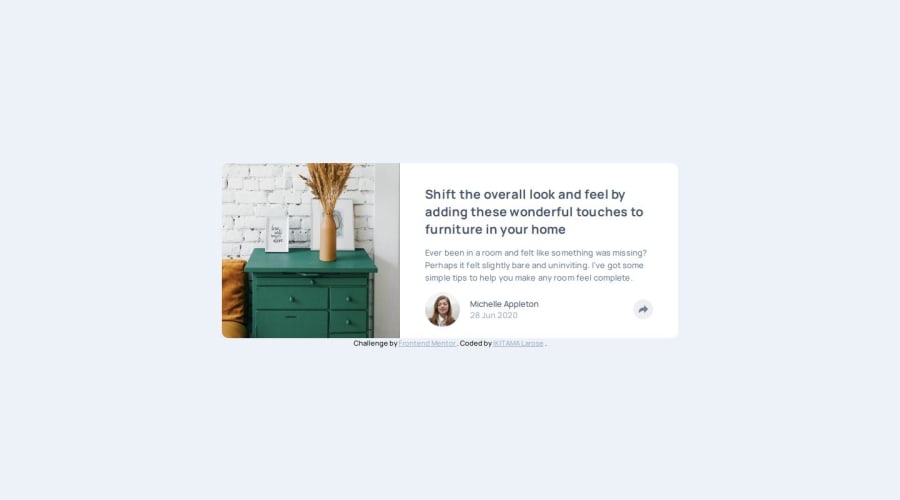
What specific areas of your project would you like help with?Any comments on the floating block above the share button .card__footer-blue (Computer screen case in the main.css file from line 271) will be welcome. As well as on my script.js
:)
Community feedback
Please log in to post a comment
Log in with GitHubJoin our Discord community
Join thousands of Frontend Mentor community members taking the challenges, sharing resources, helping each other, and chatting about all things front-end!
Join our Discord
