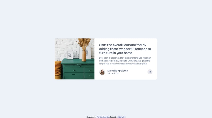
Article preview component Solution


Design comparison

Solution retrospective
** Hello everyone.**
I was not coding for 2 weeks so i ended up spending a lot more time styling it then i should have.
- Added a fade in animation for the social links window.
I wanted to practice media queries, but didn't know what breakpoints i should use. I decided to go with the breakpoints that bootstrap uses. Now my issue is that, i finished this challenge with a default CSS targeting the mobile first approach, and then i have CSS for 4 breakpoints, targeting small, medium, large and extra large devices. And Of course after having so make break-point, i think my sass looks kinda messy. Plus the final CSS file is huge!! So i was thinking, isn't it ridiculous that I've to write this much CSS for such a small component like this. Am i writing too much or this is how it should be?
Feel free to leave comments on how I can improve my code. Thanks!
Community feedback
- @seangray-devPosted over 2 years ago
Hey Siddharth! Nice job on this, I recently completed this one too!
I have a couple suggestions that could help with this challenge. It's hard to see what parts of this design is interactive. I try to think of the bigger picture, what would this component belong to? In this case a larger site that would have multiple of these components. Some of the elements in this design that would be interactive would be:
- the author of the article if we wanted to see more articles by this author.
- the article title as it would probably link to the full read of what it belongs to
- the share button
I would wrap the article title's h1 element with:
<a href="#"><h1>Article Title</h1></a>and the same would apply to the author of the article. I would also add hover and focus effects to make it obvious to the user that it's clickable and that we can interact with it. For that we could do something like this and add a transition as well:
a {
transition: all .3s ease;
}
a:hover, a:focus {
cursor: pointer;
color: (add new color that matches design or see specs);
}
Maybe check out my solution for some ideas.
Hope this helps! Keep it up and happy coding 😁
Marked as helpful0@siddharth-1407Posted over 2 years ago@seangray-dev Thanks! I really wasn't think about interactibility at all. I'll make those changes as soon as possible. Also i checked out your solution too. It looks great and i have a question. How did you manage to find the exact size for the image container. I struggled a lot with that image. In my solution the image is a bit squished if you look carefully. i wanted to go with grid too but because i didn't know the sizes i couldn't.
0@seangray-devPosted over 2 years ago@siddharth-1407 No problem! I had the design files from Figma. If I don't get the design though if you're on MAC and open the design files in preview you can click and drag and a ruler will appear giving you an approx. px value
Marked as helpful0

Please log in to post a comment
Log in with GitHub
Join our Discord community
Join thousands of Frontend Mentor community members taking the challenges, sharing resources, helping each other, and chatting about all things front-end!
Join our Discord