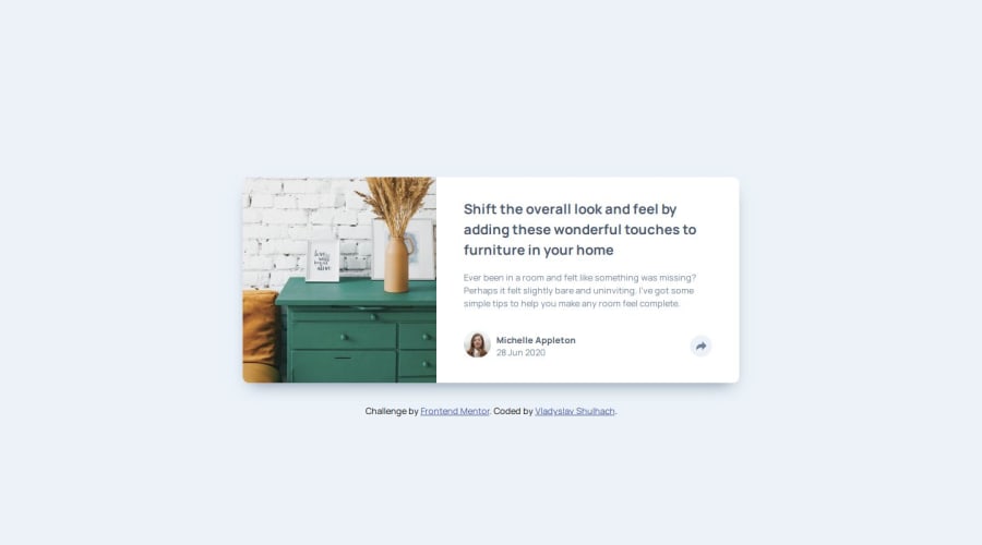
Article Preview Component Solution


Design comparison

Solution retrospective
I'm proud to have finally completed the project - what a relief! Next time I'd like to streamline my workflow to complete projects more efficiently.
What challenges did you encounter, and how did you overcome them?One challenge was to keep a steady pace throughout the project. I tackled this by staying consistent and focusing on making gradual progress.
What specific areas of your project would you like help with?I'd like to improve my styling techniques and refine my HTML and JavaScript skills. Any feedback on best practices or optimisations would be greatly appreciated!
Community feedback
- P@RahexxPosted 26 days ago
You did an amazing job with this challenge! Here is some feedback from me:
HTML:
Your HTML looks great—you use semantic tags properly, which is excellent. However, I'd recommend being more consistent with your class naming convention. Currently, you're mixing three different conventions: sometimes using underscores, sometimes dashes, and other times camelCase. It’s best to choose one and stick to it.
For example, I personally use BEM (
block__element--modifier), so instead ofblog-post__share-menu, I’d suggest renaming it toshare__menu.Another issue is the use of IDs. While not inherently wrong, they can sometimes cause problems, especially when overriding styles. It’s generally recommended to use classes instead, unless an ID is absolutely necessary.
CSS:
Your styles are clean, and you follow best practices when using variables—great job!
JS:
Your JavaScript looks good, and I love that you thought about closing the modal with the Escape key. That’s a great usability improvement!
Overall, excellent work! You should be proud of both this project and your progress.
Marked as helpful1 - @danielashjariPosted about 1 month ago
nice animations, great accessibility just I'd like to add screen reader only text
<h1 class="sr-only"> Article about furnitures</h1>.sr-only { clip: rect(1px, 1px, 1px, 1px); clip-path: inset(50%); height: 1px; width: 1px; margin: -1px; overflow: hidden; padding: 0; position: absolute; }Marked as helpful1@vladyslav-shulhachPosted about 1 month ago@danielashjari Thanks for the feedback! I’ll definitely add the sr-only text for better accessibility.
0


Please log in to post a comment
Log in with GitHubJoin our Discord community
Join thousands of Frontend Mentor community members taking the challenges, sharing resources, helping each other, and chatting about all things front-end!
Join our Discord