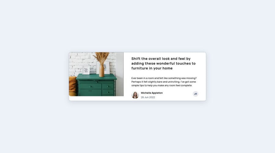
Design comparison
Solution retrospective
build using svelte frameworks and deploy with netlify
Community feedback
- @Deevyn9Posted over 2 years ago
Hi Aldi, congrats on completing this challenge. From the design comparison above, it shows that the image hasn’t been made to have a height of 100%. And after looking at the live site on mobile, it shows that the container hasn’t been made to be responsive.
Solving these problems should give you a better solution.
Good luck and happy coding 🎈
0@aldijokoPosted over 2 years ago@Deevyn9 maybe there is some advice for this image? becauce when i try to fix it, there nothing happen
0@lifeaddiktPosted over 2 years ago@aldijoko Add this propreties to your img : height: 100%; object-fit: cover; It will be better :)
0@Deevyn9Posted over 2 years ago@aldijoko give it a height of 100%, if it is a background image, make it background size: cover;
0
Please log in to post a comment
Log in with GitHubJoin our Discord community
Join thousands of Frontend Mentor community members taking the challenges, sharing resources, helping each other, and chatting about all things front-end!
Join our Discord
