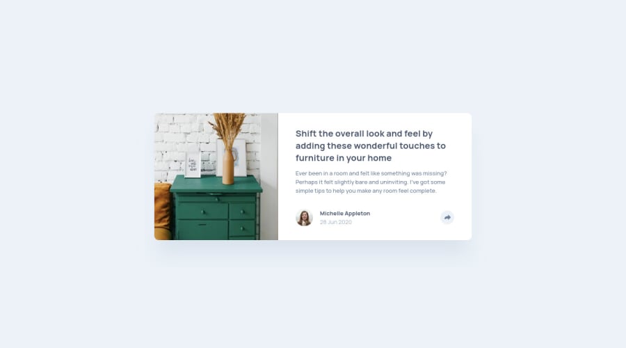
Design comparison
Solution retrospective
Please don't hesitate to comment below if you have any comment~ Thanks~
Community feedback
- @seangray-devPosted over 2 years ago
Hey CY Chan! Nice job on this, I recently completed this one too!
I have a couple suggestions that could help with this challenge. It's hard to see what parts of this design is interactive. I try to think of the bigger picture, what would this component belong to? In this case a larger site that would have multiple of these components. Some of the elements in this design that would be interactive would be:
- the author of the article if we wanted to see more articles by this author.
- the article title as it would probably link to the full read of what it belongs to the share button
- I would wrap the article title's h1 element with:
<a href="#"><h1>Article Title</h1></a>
and the same would apply to the author of the article. I would also add hover and focus effects to make it obvious to the user that it's clickable and that we can interact with it. For that we could do something like this and add a transition as well:
a {
transition: all .3s ease;
}
a:hover, a:focus {
cursor: pointer;
color: (add new color that matches design or see specs);
}
Maybe check out my solution for some ideas.
Hope this helps! Keep it up and happy coding 😁
0
Please log in to post a comment
Log in with GitHubJoin our Discord community
Join thousands of Frontend Mentor community members taking the challenges, sharing resources, helping each other, and chatting about all things front-end!
Join our Discord
