Design comparison
SolutionDesign
Solution retrospective
I think it's not so good
Community feedback
- @Mosaab-EmamPosted almost 4 years ago
I think it's very good, nice work, Stas.
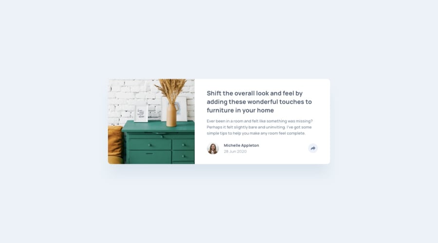
With every design you learn a new lesson. See how the original design enforces visual hierarchy. The title (important text) sticks out because it is bigger in size and bolder, and the body text (and any less important texts) are smller and have a lighter color.
If the concept of visual hierarchy is new to you, spend a few minutes looking into it, it will make your designs visually better and boost your design skills by a notch.
I wish you best of luck Stas, keep getting better.
0
Please log in to post a comment
Log in with GitHubJoin our Discord community
Join thousands of Frontend Mentor community members taking the challenges, sharing resources, helping each other, and chatting about all things front-end!
Join our Discord
