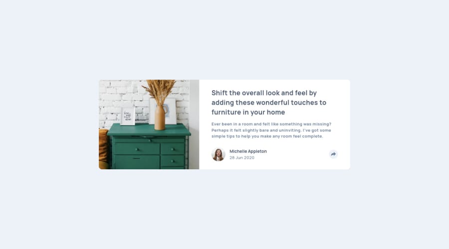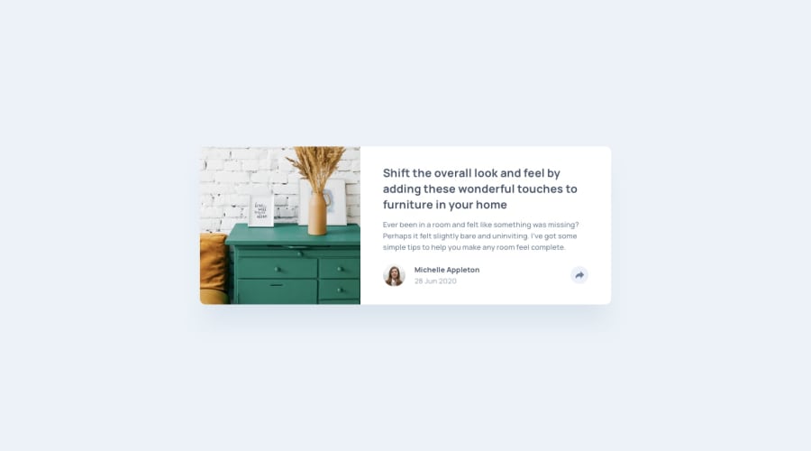
Submitted almost 3 years ago
Article Preview Component - React Based
#accessibility#react#styled-components#semantic-ui
@BrianJ-27
Design comparison
SolutionDesign
Solution retrospective
This project was fun and challenging.
What I found most difficult about building this project is knowing the best approach in knowing when and how to set aria attributes like aria-expanded on click in React.
Here are areas I am still unsure of: (I am guessing these questions could fall under best practice questions too)
- If I successfully implemented the aria-expanded attribute to the button element onClick with React.js
- For adding modals, does it matter where you add them in your layout. I was given advice to move the shared content modal to inside the card footer div in lieu of having it within my main tag. I followed the advice but I didn't understand exactly why I moved it because it didn't seem to change anything
- I added
aria-hidden= "true"on all inline SVG's as instructed too but again I didn't know why I did it. What is the reason? Also does this apply to images too? If not, then why? - Also for the modal, was it the right decision to use position absolute on it? I thought about using
transform: transformY(px)on it but thought positioning was better - Were there any areas of my code, that aren't very readable to the next developer? Ex) using styled components allows you to create your own named components. Do my names make sense or can I simplify it?
This is all I could think up for now. Thank you for your time
Community feedback
Please log in to post a comment
Log in with GitHubJoin our Discord community
Join thousands of Frontend Mentor community members taking the challenges, sharing resources, helping each other, and chatting about all things front-end!
Join our Discord
