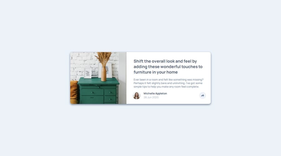


Design comparison

Solution retrospective
I am proud that I was able to complete this design and implemented the mobile-first approach. Initially, I was doing the desktop-first approach but it definitely is a lot easier doing it this way.
What challenges did you encounter, and how did you overcome them?At first, I came across some issues implementing the triangle under the div but after some quick research i was able to get construct it as intended.
/* This is the popup for the desktop mode */
.share-popup {
    display: flex;
    background-color: var(--Very-Dark-Grayish-Blue);
    gap: 1rem;
    align-items: center;
    border-radius: 10px;
    position: absolute;
    left: 75%;
    bottom: 90%;
    transform: translate(-54%, -50%);
    padding: 1rem 2.2rem 1rem;
    transition: 0.3s ease-in;
}

.share-popup::after {
    content: "";
    position: absolute;
    bottom: -14px; /* Position the pointer below the popup */
    left: 45%;
    transform: translateX(-50%);
    border-bottom: 15px solid var(--Very-Dark-Grayish-Blue);
    border-left: 13px solid rgba(0, 0, 0, 0);
    border-right: 13px solid rgba(0, 0, 0, 0);
    display: inline-block;
    height: 0;
    vertical-align: top;
    width: 0;
    transform: rotate(180deg);
  }
Any thing that I can improve on for next time. Maybe even if it has to do with relative units and how i used widths inside of the solution. Im trying to execute the feedback that AlexKMarshall told me on the discord in terms of using them appropriately. With this approach, it makes the design more responsive depending on the viewport.
Community feedback
- @Tonny-Blair-DanielPosted 2 months ago
For the image you can add the
object-fit: cover;
object-position: left;
the other things look okay
0

Please log in to post a comment
Log in with GitHub
Join our Discord community
Join thousands of Frontend Mentor community members taking the challenges, sharing resources, helping each other, and chatting about all things front-end!
Join our Discord