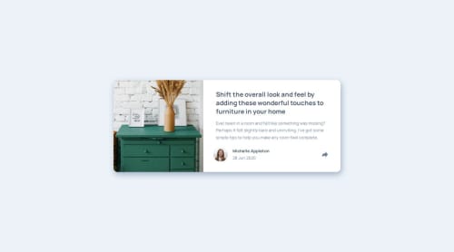
Submitted over 1 year agoA solution to the Article preview component challenge
Article Preview Component
@teuthix

Solution retrospective
What are you most proud of, and what would you do differently next time?
Proud I got the share button to work on the desktop version! Next time I hope to get this done faster
What challenges did you encounter, and how did you overcome them?Figuring out how to get the button to work on the mobile view, I reread the document object model page again and was able to get it to work when clicked.
What specific areas of your project would you like help with?I can't get the share stuff to go away when clicking the button on mobile view. It goes away when I click the button again in the website view but I'm not sure why it isn't working for mobile. It also jitters when I resize the page, not sure why!
Code
Loading...
Please log in to post a comment
Log in with GitHubCommunity feedback
No feedback yet. Be the first to give feedback on wey song's solution.
Join our Discord community
Join thousands of Frontend Mentor community members taking the challenges, sharing resources, helping each other, and chatting about all things front-end!
Join our Discord