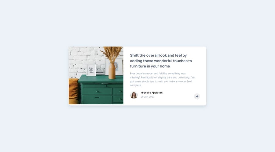
Design comparison
Solution retrospective
It's far from perfect, but was proud to get most of it by researching and for the most part, getting it done . Really enjoyed the design difference between the mob and larger screens social pop-ups. Not sure how I'd do it differently next time - as I don't have the knowledge to assess.
What challenges did you encounter, and how did you overcome them?As mentioned - it's far from perfect. The svgs spooked me a bit - not sure If they were implemented properly - the image and padding was for me a headache - am still not 100% happy with how that worked out with responsiveness on the larger screens. Also I haven't really understood the positioning for the pop-up for largers screen sizes - it's doesn't behave in responsive way.
What specific areas of your project would you like help with?In terms of the responsiveness I'd like to develop a less ramshackle approach for margins - paddings and the proper way to position the hidden social pop-ups for screen sizes -plus the right way to use svgs and svgs for as active icons. I'm seeing this as a first draft - am definitely going onto discord to get more advice.
Community feedback
Please log in to post a comment
Log in with GitHubJoin our Discord community
Join thousands of Frontend Mentor community members taking the challenges, sharing resources, helping each other, and chatting about all things front-end!
Join our Discord
