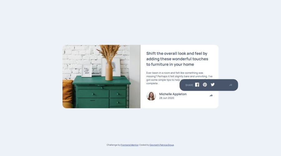
Design comparison
Community feedback
- P@NikitaVologdinPosted 7 months ago
Cool work. For semantic HTML suggest you use such tags like main, article, header, footer. You can read about it here: https://developer.mozilla.org/en-US/docs/Glossary/Semantics#semantics_in_html So your html structure may look like this:
<body> <main> <article> <header><h1></h1></header> <div class="description"></div> <footer><div class="avatar"></div></footer> </article> </main> </body>For <img> attribute alt="drawer" should contain more detailed information about image. You can find out about this here: https://www.freecodecamp.org/news/what-is-alt-text-image-alt-text-html-example/
Great work with responsiveness.
You are using css property height to display pop-up i suggest you to try opacity it may look much nicer. Here is the link: https://developer.mozilla.org/en-US/docs/Web/CSS/opacity
Best, Nikita
0
Please log in to post a comment
Log in with GitHubJoin our Discord community
Join thousands of Frontend Mentor community members taking the challenges, sharing resources, helping each other, and chatting about all things front-end!
Join our Discord
