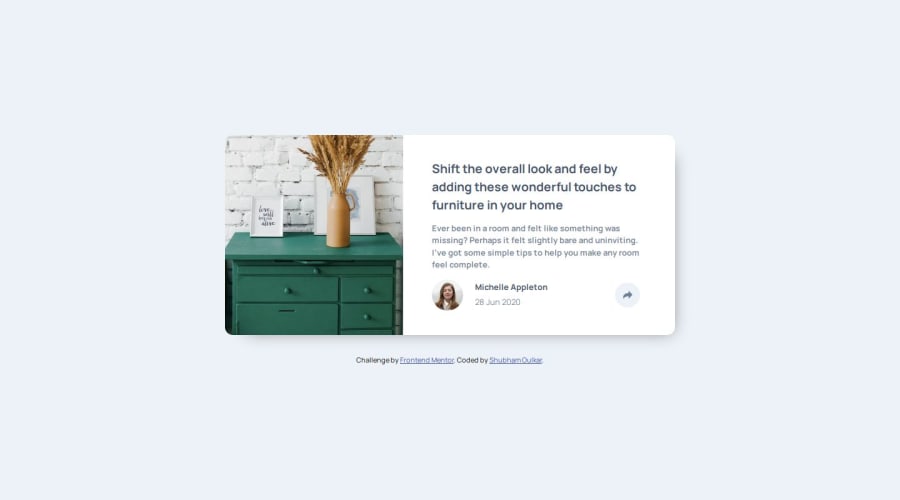
Design comparison
SolutionDesign
Solution retrospective
What are you most proud of, and what would you do differently next time?
I designed this card using a desktop-first layout. Next time, I will adopt a mobile-first approach.
What challenges did you encounter, and how did you overcome them?Due to the desktop-first approach, I spend more time in designing tooltips for mobile screens. It proved to be a challenging task. However, I managed to overcome this challenge by implementing two separate tooltips for desktop and mobile devices. I believe adopting a mobile-first approach will solve this process, by using a single tooltip solution.
What specific areas of your project would you like help with?I want feedback on my CSS code. I want to write more modular CSS.
Community feedback
Please log in to post a comment
Log in with GitHubJoin our Discord community
Join thousands of Frontend Mentor community members taking the challenges, sharing resources, helping each other, and chatting about all things front-end!
Join our Discord
