

Design comparison
SolutionDesign

Solution retrospective
What are you most proud of, and what would you do differently next time?
I am proud of the fact that I managed to make it somewhat responsive
What challenges did you encounter, and how did you overcome them?I couldn't figure out how to make it responsive at first but after some googling I managed to do it
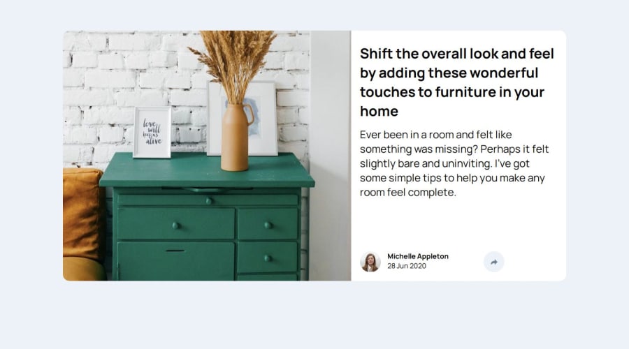
What specific areas of your project would you like help with?I still don't know how to make the desktop active state and how to make that inverted triangle at the bottom of the share box in the desktop version. Also the share button looks a bit odd, I couldn't shape it into a perfect circle even though I set the radius to 50%? And how do I center the arrow icon within the circle?

Join our Discord community
Join thousands of Frontend Mentor community members taking the challenges, sharing resources, helping each other, and chatting about all things front-end!
Join our Discord