

Design comparison
SolutionDesign

Community feedback
- @elClassico-engPosted 2 months ago
Hi! 👋 Great job on completing the challenge! I’ve gone through your code and noticed a few areas that could be improved:
- HTML Semantics: Replace some div elements with semantic tags like <section> or <aside> for better accessibility.
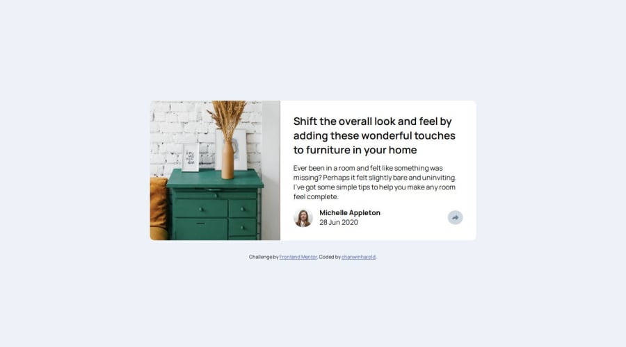
- Image Alt Text: The alt attributes could be more descriptive (e.g., "desk picture" could be "A desk with drawers for home furniture tips").
- Responsive Styling: The social media links and share button positioning could be improved for mobile devices to enhance usability.
- CSS Optimization: There’s some repetition in media queries. You could group them to simplify the styles.
- Typography: Using relative units like rem or clamp() for font sizes would make your design more responsive.
- CSS Variables: Implementing CSS variables for colors and fonts can improve maintainability.
Hope this feedback helps you refine your project! Let me know if you’d like detailed examples for any of these points. 😊
Marked as helpful0

Please log in to post a comment
Log in with GitHubJoin our Discord community
Join thousands of Frontend Mentor community members taking the challenges, sharing resources, helping each other, and chatting about all things front-end!
Join our Discord