Submitted 3 months ago
article-preview-component-master using HTML , CSS and JS
@Rakshitha971
Design comparison
SolutionDesign
Community feedback
- @SurajCaseyPosted 13 days ago
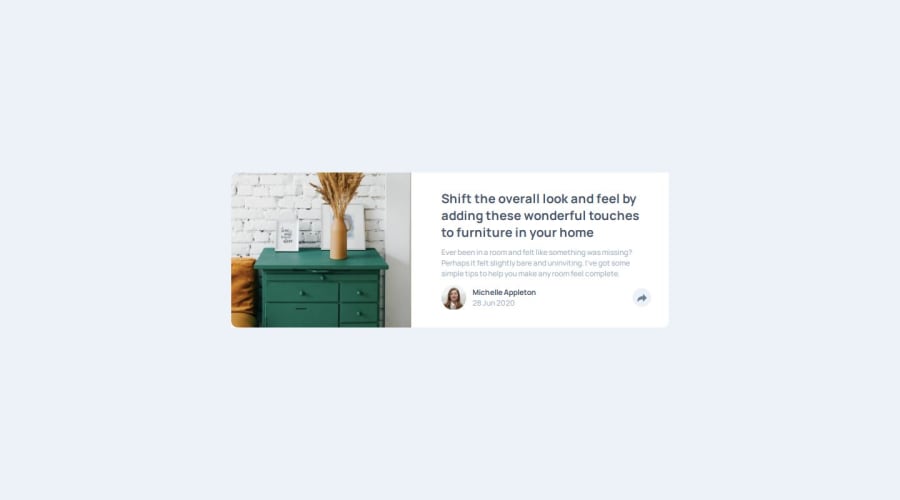
Your solution looks so good. Especially, in the mobile screen it matches perfectly. The codes are well-structrued and readable. The only thing that you could do is use flexbox to make the content be in the middle of the screen, you could do the following: body { background-color: #ecf2f8; height: 100vh; display: flex; justify-content: center; align-items: center; } The whole container will appear in the middle of the screeen and will look perfect.
0@Rakshitha971Posted 3 days agoHi @SurajCasey Thanks for your feedback , and i have made changes and updated.
0
Please log in to post a comment
Log in with GitHubJoin our Discord community
Join thousands of Frontend Mentor community members taking the challenges, sharing resources, helping each other, and chatting about all things front-end!
Join our Discord
