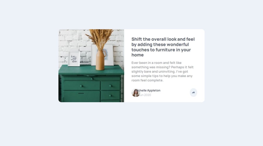


Design comparison

Please log in to post a comment
Log in with GitHubCommunity feedback
- @hannibal1631
Well Nisha, I've looked at your code structure. I must point out a few things that you should definitely take a look at.
-
you've used <article> which is not necessary at all. just Use
<main></main>as the primary parent if you have to. Because you've used article, your page is not responsive when shrinking and it has unnecessary spaces. -
after
<main>use two separate<div>. one for the image and one for the content. -
instead of using the image in html, use it in css as
background-image: url();. So you can change the background image for mobile devices without js. -
Inside
.author-detail, you should've made two div. one for the profile-pic and name/date and one for the share button. It would've been simple to style it. -
As you can see your pic is overflowing the name/date, that could've been avoided.
-
Your share popup is not aligned perfectly.
-
lastly, you don't have to use that much media query. just style for big screens first, then only manipulate the values that needs to be manipulated for smaller screens i.e.
max-width:475px;.
Hope this gives you clear vision. Let me know if this helped or not. If yes mark it as helpful.
And i see you're from dhanbad, i'm from asansol. So let's connect, so we can work on projects in future. Let me know if you're interested. Happy Coding!!!
Marked as helpful -

Join our Discord community
Join thousands of Frontend Mentor community members taking the challenges, sharing resources, helping each other, and chatting about all things front-end!
Join our Discord