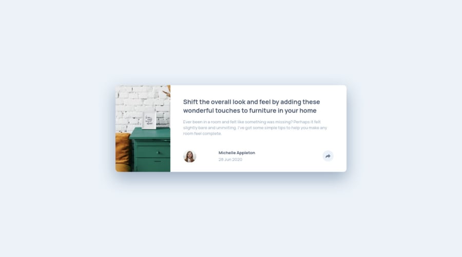
Design comparison
Solution retrospective
Hi, thanks for having a look at my work!
It's my 4th challenge on this website.
This one was a bit tedious because it needed to make 2 different active menus (mobile + desktop).
It made me practice my DOM JS a bit. I realise that working with React.js really makes interactions easier :)
I might rework this project to add a bit of animation.
I made breakpoint at 800px because it was the point where the desktop started to look better than the mobile solution. Am I allowed to do that or should I stick with the bootstrap grid breakpoints ?
This project is my 4th one of my 365 serie for 1 project per day :)
Feel free to share any way I can improve it, see you !
Community feedback
Please log in to post a comment
Log in with GitHubJoin our Discord community
Join thousands of Frontend Mentor community members taking the challenges, sharing resources, helping each other, and chatting about all things front-end!
Join our Discord
