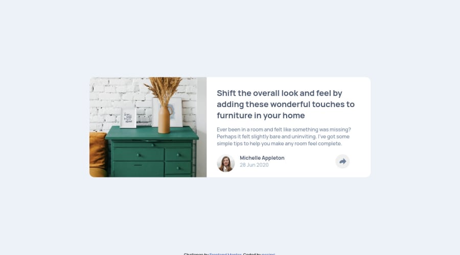
Article preview component master - HTML,SCSS(Flexbox, Grid),JS
Design comparison
Solution retrospective
Hello there, after some time finally managed to finish this challenge as well. If u think there's anything to improve about my code let me know, especially the triangle which I am not sure I got right, also should I use the images as backgrounds only or is the way I did it good?
Community feedback
- @argelomnesPosted about 3 years ago
Hey @pccipri,
I think you got the triangle just fine on the desktop. However, you'll need to hide it when on mobile. I noticed the arrow’s tail was chopped off. This is caused by the
border-radius.For the images as backgrounds, yes, the way you did it is good. But I think using the furniture as an inline image is better.
Marked as helpful1@pccipriPosted about 3 years ago@argelomnes Hey thanks for the feedback, btw managed to fix the image border and the triangle, again thanks for the tips.
0
Please log in to post a comment
Log in with GitHubJoin our Discord community
Join thousands of Frontend Mentor community members taking the challenges, sharing resources, helping each other, and chatting about all things front-end!
Join our Discord
