

Design comparison
SolutionDesign

Community feedback
- @devdrivenaiPosted 3 months ago
This was a really cool solution! There were many things that I really liked, but some that stand out:
- the transition of
.share-linkspopup on mobile is just dope! :) - the shadow around the
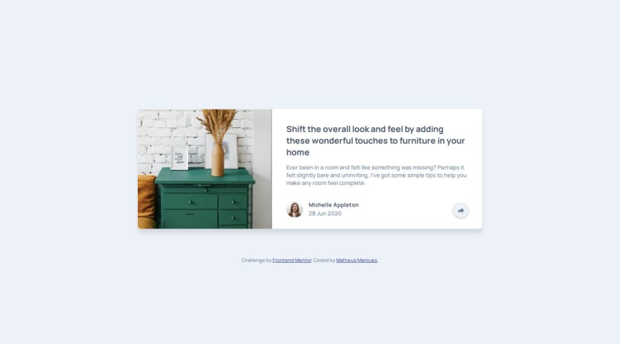
.sharebutton feel like a fresh, intuitive addition. - the transition with scaling on the furniture picture makes it come alive.
Hard to come up with suggestions here, but here is my best attempt:
- some of the
divs could use more semantic elements (like section, article, button, etc.) - maybe adding also a transition to the
.share-linkspopup on larger screens?
Overall, though, really inspiring one!
Marked as helpful1 - the transition of

Please log in to post a comment
Log in with GitHubJoin our Discord community
Join thousands of Frontend Mentor community members taking the challenges, sharing resources, helping each other, and chatting about all things front-end!
Join our Discord