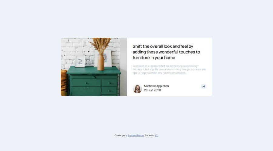
Design comparison
Solution retrospective
i'm happy that i write a loop to generate different social media icons and paste to the bar
What challenges did you encounter, and how did you overcome them?it took me a while to do the grid and set the attribute of images
Please log in to post a comment
Log in with GitHubCommunity feedback
- @SvitlanaSuslenkova
body { display: flex; flex-direction: column; justify-content: center; align-items: center; min-height: 100vh; } Try this to align(top-bottom) and justify(left-right) your project to the center. It applies to the parent component(body), don't forget about !!min-height!!. You can use grid instead of flex too.
Marked as helpful
Join our Discord community
Join thousands of Frontend Mentor community members taking the challenges, sharing resources, helping each other, and chatting about all things front-end!
Join our Discord
