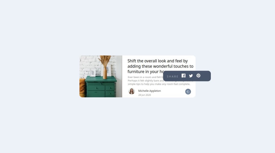


Design comparison
SolutionDesign

Community feedback
- @snigdha-sukunPosted 4 months ago
The tooltip in your solution looks amazing!!
Your solution looks good on desktop but it does not look like the one provided when we switch to mobile view. You should try using
@mediato style your UI for different screen-sizes.@media (min-width: 768px) { main { flex-direction: row; width: 80em; padding-bottom: 0%; overflow: visible; } . . . }You can use
@importin CSS file to import the required font-family:@import url('https://fonts.googleapis.com/css2?family=Manrope:wght@200..800&display=swap');You can use
:rootto define all the variables which will be used throughout the css file, and then reuse it everywhere::root { --very-dark-grayish-blue: hsl(217, 19%, 35%); --desaturated-dark-blue: hsl(214, 17%, 51%); --grayish-blue: hsl(212, 23%, 69%); --light-grayish-blue: hsl(210, 46%, 95%); --font-family: "Manrope"; } body { font-family: var(--font-family); color: var(--very-dark-grayish-blue); background-color: var(--light-grayish-blue); }0

Please log in to post a comment
Log in with GitHub
Join our Discord community
Join thousands of Frontend Mentor community members taking the challenges, sharing resources, helping each other, and chatting about all things front-end!
Join our Discord