

Design comparison

Community feedback
- @ashandcompanyPosted 4 months ago
The structure of the HTML document is clean and well-organized, with good use of semantic elements like <h2> and <p>, which greatly improve accessibility and readability. The code is generally easy to follow.
One thing to keep in mind is that the alt attributes for the images are currently empty. It would be great to add some descriptive alt text here, which will make the site more inclusive for users who rely on screen readers.
The layout looks fantastic on most screens ! It’s responsive and adapts well, but on smaller screens like mine, there’s a slight overflow. It’s a minor issue, but it could be improved by the CSS or adding more specific breakpoints to ensure everything stays within the page.
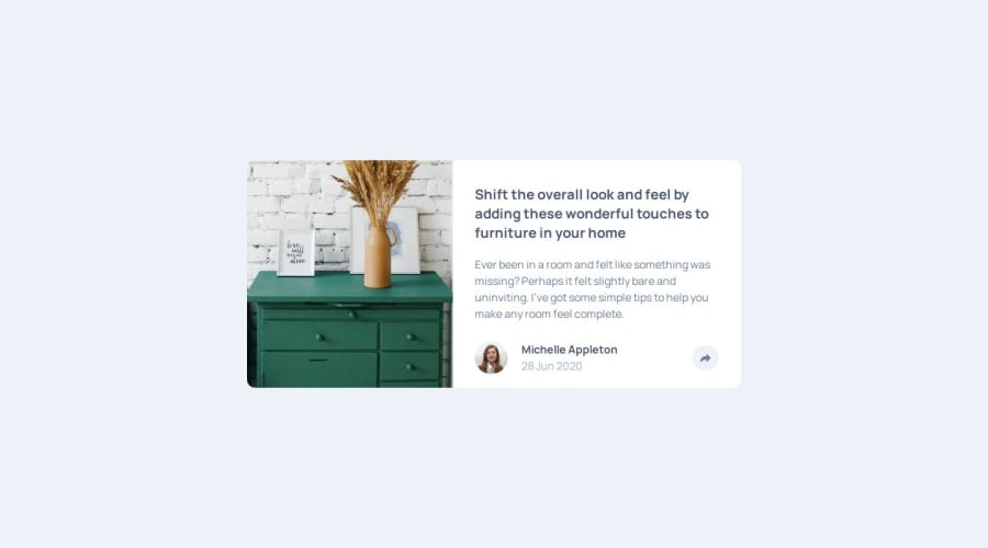
In terms of the overall design, it looks very close to the original, with just a small difference in the button’s appearance. On desktop, the button works as expected, but it doesn’t quite match the design example.
Overall, this solution is very solid and visually appealing. Great work :)
0

Please log in to post a comment
Log in with GitHubJoin our Discord community
Join thousands of Frontend Mentor community members taking the challenges, sharing resources, helping each other, and chatting about all things front-end!
Join our Discord