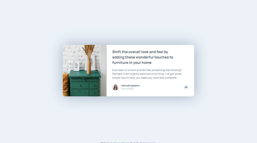
article preview component made with HTML, CSS & JS
Design comparison
Solution retrospective
I was proud of the fact that I had no problem doing the layouts and it was relatively easy.
What challenges did you encounter, and how did you overcome them?The share section on the desktop version was difficult to implement and I hope to get better at implementing such a feature and for it to be consistent throughout multiple screen sizes. I struggled with the picture and I needed to look up some solutions. I did not find my solution for the multiple screens.
What specific areas of your project would you like help with?I need help with the desktop version of the share section. I got it to display properly on a really large screen (I've been working on a tv screen) and on an ipad mini screen however as i added more media queries it ended up breaking the code. I need help implementing that part of the project.
Community feedback
Please log in to post a comment
Log in with GitHubJoin our Discord community
Join thousands of Frontend Mentor community members taking the challenges, sharing resources, helping each other, and chatting about all things front-end!
Join our Discord
