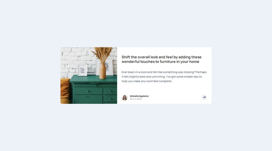
Design comparison
SolutionDesign
Solution retrospective
What are you most proud of, and what would you do differently next time?
I discovered the svgr package which fixed a lot of problems I was having with using svg's for this and all prior front end mentor projects
What challenges did you encounter, and how did you overcome them?The active states were a lot more tricky than I initially thought thanks to the mobile and desktop active states being different. It took a lot of finicky work, but I got something good going.
What specific areas of your project would you like help with?I'm not really sure if what I did with my state was best practice or not. It seemed fine, but I could have arrived at a suboptimal solution
Community feedback
Please log in to post a comment
Log in with GitHubJoin our Discord community
Join thousands of Frontend Mentor community members taking the challenges, sharing resources, helping each other, and chatting about all things front-end!
Join our Discord
