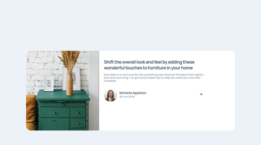
Design comparison
SolutionDesign
Solution retrospective
I couldn't match the desktop design. Hopefully practicing JS more will help in future. Please do comment. Suggestions are helpful.
Community feedback
- @tesla-ambassadorPosted over 2 years ago
Hey Emtiaz. This is a really great solution, congrats on completing this challenge! Here's a few pointers:
- Your website is pretty responsive but I noticed that you kinda had a hard time keeping the consitency of your desktop design across screens with similar size. I tweaked around with your code and came up solution to help you fix that:
@media screen and (min-width: 800px) {
  .container {
    display: flex;
  }
  .hero {
    height: 100%;
  }
}
It worked pretty fine!
- You might also want to use the <img> element nested in your <button> element as a background for the button so that you resolve some accessibility issues.
- Your heading tags must be in some logical order therefore instead of passing the <h6> you should pass the <h2> tag and style it as you deem fit and then lastly you should also enclose your <div> tag with class "attribution" in a <footer> tag. This will resolve your accessibility issues! Happy coding and keep up the good work 👍
0
Please log in to post a comment
Log in with GitHubJoin our Discord community
Join thousands of Frontend Mentor community members taking the challenges, sharing resources, helping each other, and chatting about all things front-end!
Join our Discord
