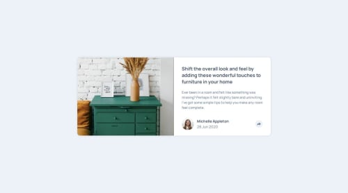
Article Preview Component

Solution retrospective
I would like to make modifications to the text balloon that is displayed when the Share button is pressed, specifically about the way in which this type of elements should be designed within the structure of the web page, but right now I can't think of it. nothing.
What challenges did you encounter, and how did you overcome them?This time I had no problems with the length and width of the card, since I was able to set a size that adapts to different devices, this time I had problems with the content that is displayed when the Share button is pressed, in a phone view I didn't have any major problems but when displaying it as a text balloon I couldn't properly handle the position in which it can be found in certain resolutions.
What specific areas of your project would you like help with?As I mentioned above, I had complications regarding the content that is displayed when pressing the Share button, I would like to ask for advice or recommendations to better manage the position in which said content is (speaking from the desktop view, on the phone I think it looks good).
Please log in to post a comment
Log in with GitHubCommunity feedback
No feedback yet. Be the first to give feedback on Jorge's solution.
Join our Discord community
Join thousands of Frontend Mentor community members taking the challenges, sharing resources, helping each other, and chatting about all things front-end!
Join our Discord